Client: Holdfast Adventure Therapy
Services: Branding & Identity, Logo Design, Merchandise.
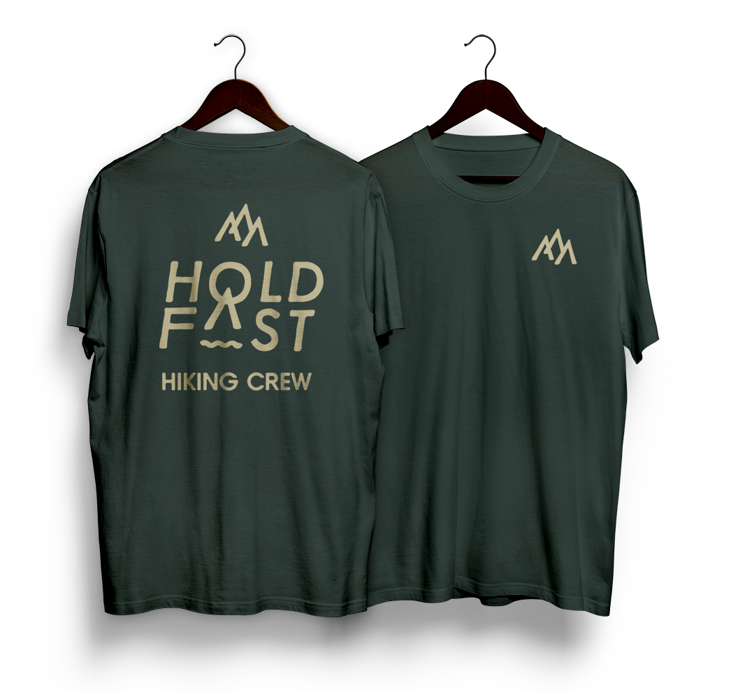
Holdfast Adventure Therapy
Brief: The ability to be flexible with the identity will be good to reach the target audiences 10-18 year olds and their families. Referencing nature, earthy colour tones and perhaps organic shapes to communicate the nature of the activities but also growth / evolving which are the potential benefits for clients.
The Hold Fast brand is rooted in the outdoors and needed to invoke that feeling of adventure. Whilst playing with mountain and sun shapes the "AHA" moment of being able to combine these outdoor elements into the logo type and still have it legible seemed like a winner from the start. Everything seemed to fall into place from here, the natural earthy colours worked really well with the organic type face and the idea of angled logo representing forward progression and development all combined created a really strong brand.